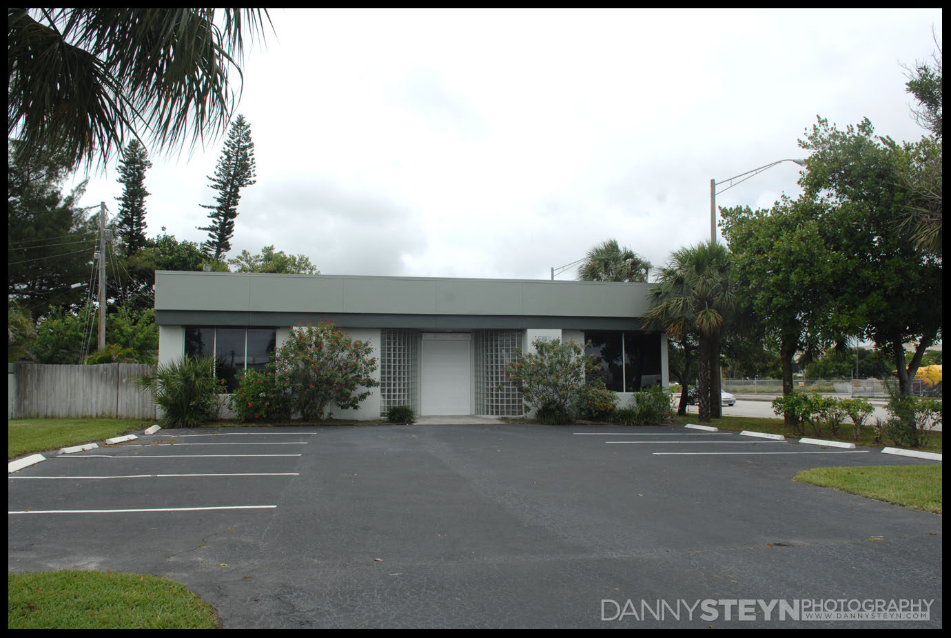
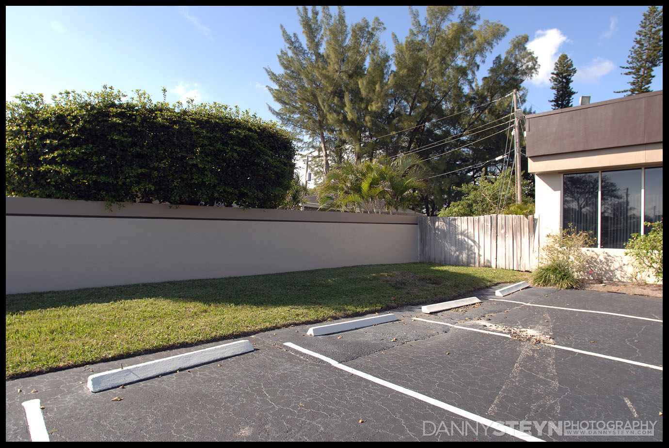
Prior to selling the studio the previous owner had a done a great job of painting the studio, but s you can see in the image above, the green colors they had chosen did not fit our color palette, and more importantly they blended in too much into the background.
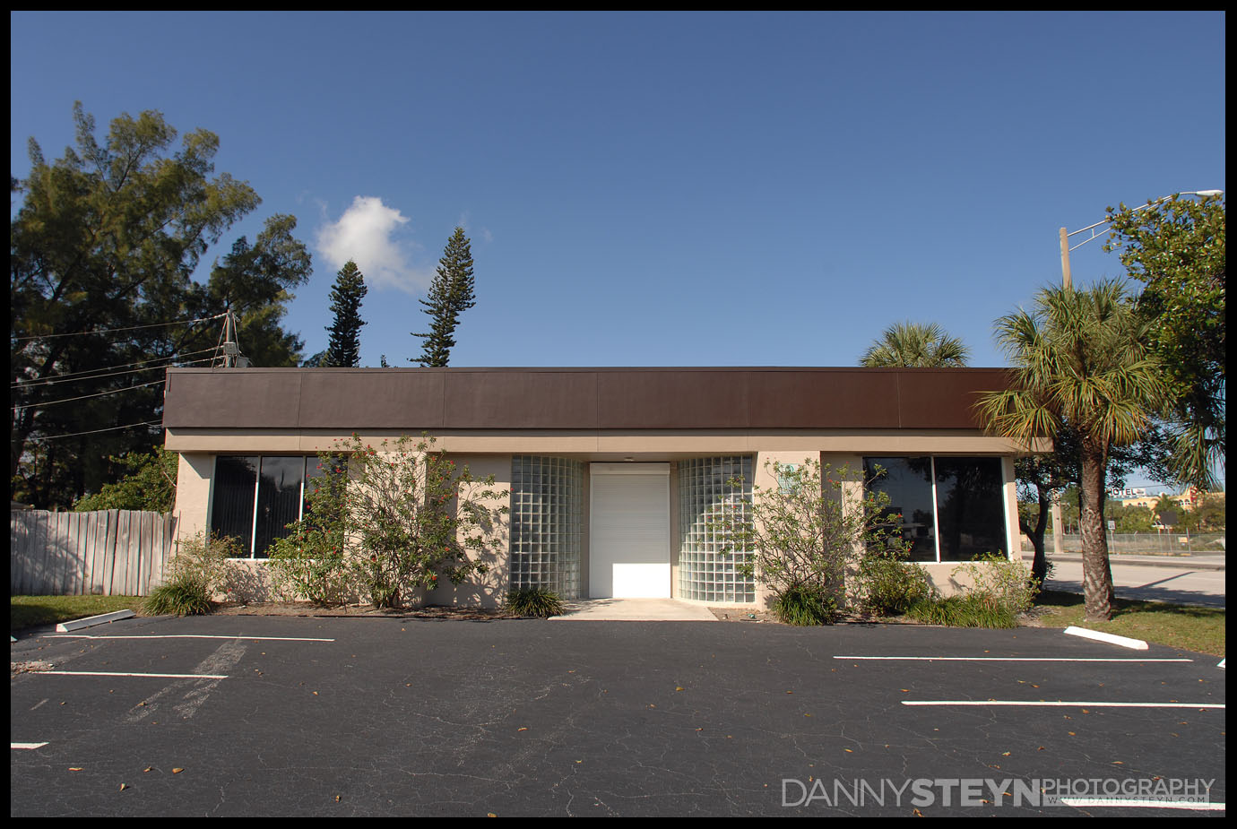
With over 50,000 cars a day passing by we wanted a color scheme that would attract attention, be in line with our corporate color palette, and not be too un-Florida!
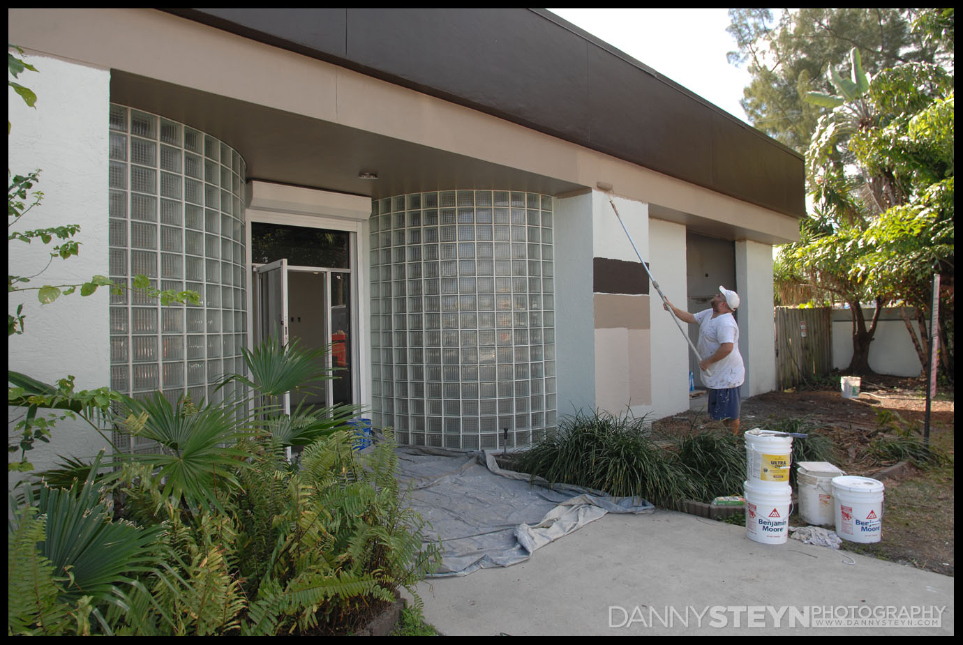
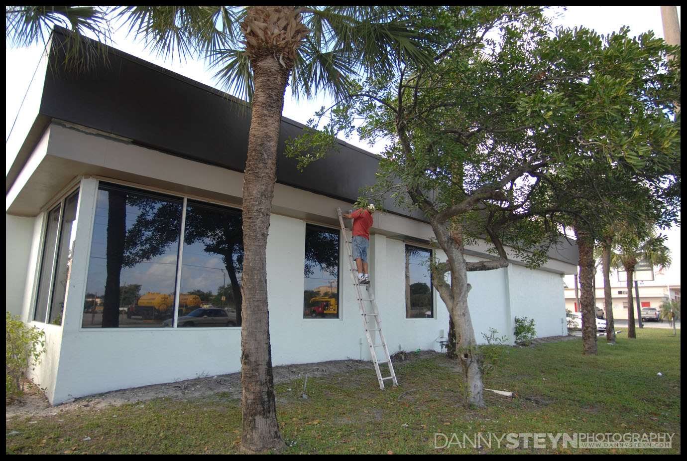
So we chose the color palette similar to our current web design – a darker coffee color at the called black raisin, a medium taupe waistline below and a light taupe for the majority of the walls. The back-lit store front signs that are being designed are in white and with the dark background they will easily be visible in both daytime and nighttime.
While we like the dark black raisin as the top color for the building, we inverted the colors for the wall as we did not want to white bird droppings to show up on the boundary wall where they often congregate, so here the dark raisin color is used as the waistline to separate the two shades of taupe

